 Lately I’ve stumbled
upon a ton of perceptual map generating websites and have been having a
blast playing around with them. Of course, as
MBA students I’m sure we’re all pretty familiar with the concept of perceptual mapping and some of us are pretty handy at building maps from scratch in Excel. I for one, however, discovered recently that
perceptual maps can be more than just an exercise in creative procrastination. They can actually be incredibly useful. But unless you’re
some kind of Excel jock consultant or an advanced quantitative data analyst, you may not realize just how
great they are for business.
Lately I’ve stumbled
upon a ton of perceptual map generating websites and have been having a
blast playing around with them. Of course, as
MBA students I’m sure we’re all pretty familiar with the concept of perceptual mapping and some of us are pretty handy at building maps from scratch in Excel. I for one, however, discovered recently that
perceptual maps can be more than just an exercise in creative procrastination. They can actually be incredibly useful. But unless you’re
some kind of Excel jock consultant or an advanced quantitative data analyst, you may not realize just how
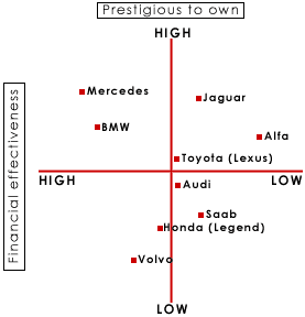
great they are for business. In general, people are accustomed to the double axis brand map where dichotomous scales cross to form four quadrants where various points within each sector represent the respective magnitude of attributes. For example, “Budget,” versus “Premium,” along one axis and “High” versus “Low Quality” on the other. The example above is one of those basic maps. Kinda boring and not exceptionally useful.

“Perceptual mapping is a diagrammatic technique used by asset marketers that attempts to visually display the perceptions of customers or potential customers. Typically the position of a product, product line, brand, or company is displayed relative to their competition.”
") | |
Map of Columbia Business School |
When we consider the
implications of the internet for perceptual mapping, the possibilities expand
immensely. The advent of powerful JavaScript techniques combined with the rich data the Internet enables us to mine, has made it
possible to generate comprehensive maps incorporating tons of variables. Users can also easily manipulate these maps to visualize
how market segments might react to changes in any number of mapping factors. For example, TouchGraph.com (example below),
builds perceptual maps of related websites based on SEO keyword data.
 |
| SEO Map of BandCamp.com on TouchGraph |
One of my favorites is
definitely the Linkedin Professional Network Map (Feel
free to check mine out and try it yourself.)
- LivePlasma.com
- gnoosic.com
- TouchGraph.com
- Musicovery.com
- VisualComplexity.com
- TuneGlue
 |
| My Linkedin Network Map |
This is a smart blog. I mean it. You have so much knowledge about this issue, and so much passion. You also know how to make people rally behind it, obviously from the responses. internet marketing
ReplyDelete